Growing up is bittersweet. Luckily for Urban Gateways, it has mostly been sweet. We welcomed Street Level (our youth digital media center) into the fold in January 2017; we’re launching our Teen Arts Pass (TAP) program this spring; we have new staff, new artists, even a new office space. But there’s always a sense of nostalgia for where we’ve been and what we’ve done. Since 1961, Urban Gateways has provided thousands of arts programs to hundreds of thousands of young people in Chicago. Our goal is to remain linked to our long and rich history, while moving purposefully into our future: as we grow, transformation is necessary. We hope to reflect the change – both individual and societal – that we encourage young people to undertake through the arts.
We are excited to share with you our new look, representing a new iteration of Urban Gateways that seamlessly incorporates Street Level, TAP, and all of our programs (residencies, performances, and more) that have engaged young people for decades. Working with designer Bob Faust of Faust, Ltd as a consultant – an undertaking that was generously supported by Forefront’s Mission Sustainability Initiative – we created a new logo, transformed our previous “slinky/squiggle” image into a striking and multi-faceted pattern, honed a new color palette, and wrote a new mission statement. You can see all of this reflected across our website today.
THE LOOK
Bob Faust, our designer, is the expert – so we’ll let him tell the story:
“We have a long history with Urban Gateways – in fact my first employer, Don Strandell, created the ‘squiggle’ or as we would call it the ‘slinky’ logo. So the initial conversation was really about identifying why this was the right time for a change and how extensive that change would be. We know Urban Gateways has considerable new audiences, especially teens and older youth through Street Level and TAP. After completing design tests as minor as keeping the squiggle or remixing it with new typography and as complete as entirely new graphic gestures, we collectively determined there was much to gain from a brand new visual expression of Urban Gateways. We set out collecting input from Board members, staff, and other stakeholders. A word map derived from positioning statements submitted by those stakeholders – with the most frequently used words taking up the most space – drove our visual explorations and ensured we stayed on track.
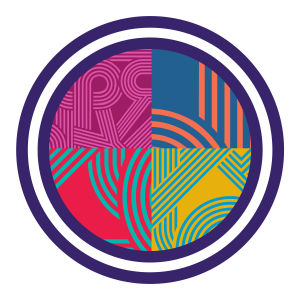
We ultimately ended up sharing five visual directions that we felt were all strong, and then asked the Urban Gateways Rebranding Committee to weigh in. A near unanimous decision to go with a strictly typographic logo surprised us all but allowed the new logotype to attach to many concepts. The new Urban Gateways logo is a typographic representation of the organization’s role as both a guide and path-paver for young people to express themselves through an artistic lens. The logotype can be used in combination with a complementary pattern made from the letterforms itself, as well as an extended palette that allows for myriad color combinations and steers clear of anything that could be interpreted as corporate. All this allows for dynamic, infinitely changing designs.”
In the new design elements, our staff members see cables crossing the floor at Street Level. We see motherboards, a staff of sheet music, a dance choreography sequence – maybe this is how we knew which design was the right one for us. The look feels retro, but it also feels fresh: the Urban Gateways of the 60s, 70s, and 80s meets the Urban Gateways of today.
THE WORDS
We devoted many hours to finding the right words to describe our new identity. From dozens of mission brainstorming worksheets submitted by staff and Board members, to an 8-hour staff meeting involving 40 action words (whittled down from many more), 500 post-it notes, and countless detailed wordsmithing conversations…
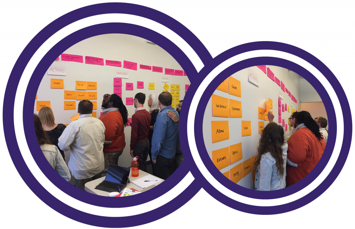
…to editing by our Communications team, more editing at Board committee meetings, and a supporter survey, we placed thorough exploration front and center. The final result of this extensive and collaborative process was our new tagline, “Creating Art, Inspiring Change”, and our new mission and vision statement:
Urban Gateways engages young people in arts experiences to inspire creativity and impact social change. We work to overcome social and economic barriers for youth to access Chicago’s artistic and cultural vitality. Our vision is a creative and artistically responsive society.
We hope that our new logo, our new designs, and our new mission statement sing to you as they do to us. And we hope you’ll click around on our website and do some exploring of your own – after all, the path is clearest when you’re right there with us.